Ebb and Flow Art Quilt

Planning here for the Ebb and Flow themed art quilt to go in the TQG art prize. As usual not much time left so need to get going.

I have started making a range of fabrics by combining my dyed fabrics from the outback with rough raw edge appliqué in the following configuration based on the composition of the following photo. The collage technique in the coursework has inspired me to start with a fabric collage technique to create a unique fabric and then move on to cutting that up in order to abstract the idea a bit while staying true to the colour combinations.

I’ve left this black and white so I can introduce the appropriate colours based on the changing weather.

Next the plan is to cut these fabrics into 5 inch raw edge approximate squares. Because of the nature of my sloppy appliqué the squares are not all perfect but I plan to leave them raw edge and apply them with space in between to a further dyed batting background. I’ve ordered some woven batting because my cotton batting went crazy with shrinkage and shredding in the washing machine after dyeing.

Next the plan is to grade the squares from the different weather states across the quilt in some way. Sort of similar to a colourwash quilt. I’m doing this because I always enjoy working on small individual pieces to create a series of mini landscapes within the larger landscape. But also as a bit of a nod to traditional quilting.

I’m not sure of the shape yet. I am bound by the constraints of max 150 x150 cm when I would have like to do something more like 50 x 300 cm so that it would read left to right and I could emphasise the ebb and flow idea. I’m thinking now about using a golden mean rectangle with the long edge close to 150. That would make the short side around 90 cm and the long edge 146 cm.

I’m not sure how to flow the blocks across so the ebb and flow of water, land and foliage is best illustrated. Possibly diagonal so that it reads across with a forward leaning diagonal?

Plan to individually embellish each square to make them tiny works of art in their own right but hopefully also work together to read as I planned.

Finally I would like it to hang fairly stiffly rather than drape like a painting with texture rather than completely as a crinkled quilt. For this I may apply the lot to unstretched canvas and quilt heavily in diagonals over the top. Don’t want this quilting to be too dominant so I may use fine red dirt coloured thread, just to apply the haze of red dirt over my landscape.

Will need to find out what the rules are about binding. I’d be happy not to bind and just maybe seal the edge with paint? Or can it be stretched on a frame? I like stretched on a frame because it can be removed afterwards and used in other projects that need drape. I just don’t like the drape of a quilt on a wall. I think the surface is better displayed stretched. Maybe I could stretch over a board?

Had a range of other ideas since then:

-Interfacing to back of individual blocks making them stiff enough to felt through. I have a woven fusible interfacing so should be able to do the felting through that.

-Once individually felted will hopefully be quite stiff. Plan is to add stitch at this stage to try and enhance the mini landscape feel of each block. Then can then be attached to dyed woven batting and backing and further embellished with quilting.

-Revisited the outback photo I have that highlights all the colours of the outback with storm and blue sky, orange dirt and trees. The palette there does not include anything that is truly green. Today I sorted out the fabrics that I dyed from life while there and selected that palette. It does look harmonious and natural and has made me rethink how much of the brighter green I need in the quilt. Think I will make a collage of this colour scheme for a few more blocks and then make one with very small amounts of brighter green only. I think the bright green is present in the landscape in close up and needs to be included as part of the ebb and flow.

Collage studies (3.4) Part One, sketchbook planning

I have created this sketch in Adobe draw, by inserting the image underneath and working directly over the image to translate the image into basic geometric shapes and a small palette of representative colours.

This is planning for my simple collage.

Next I’m thinking about what might be an unusual colour combination. I already find the above a slightly clashing combination because it uses natural browns and greens with man made vivid blue and red. Perhaps I could highlight this by muting the natural colours and highlighting the man made. So I would be combining an earth palette with a brights palette. Not something I would usually do or like but that might make it unusual. As far as layout goes I think I could use a variegated natural background with a flat tone brights slashing across the middle.

Here I have tried to create a muted natural colour background predominantly brown and green, and tried to introduce a harsh red and blue overlay. The tonal difference is probably not striking enough. I want the vivid colours to be a pure tone, no complementary and no black or white, and the background colours to be mixtures with complementary and black and white. I didn’t realise this until I had started the image and then tried to push back the background. I have some papers that I created with natural variegated tones and hues that I have painted to try and match with the photo, and I could create further colour contrast by using commercial flat colour papers for the vivid items. Not sure how successful this is and I don’t like it, but I am trying for unusual.

The traditional unusual combinations of blue and green ” blue and green should never been seen without a colour in between” I actually love and use a lot. One thing I note though doing this exercise, is that the combinations become more unusual and perhaps unpleasant when you vary the tone as well as the hue. So pastel blue and vivid emerald green would look more unusual.

Another “unusual” combination that I love is pink and orange. Pastel pink and vivid orange would make this more unusual.

Finally a complex colour combination. I’m not really sure what this means. Perhaps it could be including as many as possible of the colours in the photo. Or building up the colours by using fragments of multiple colours to create the final overall appearance. I think my idea of complexity in colour does mean breaking things down into lots of subtle colours with unexpected juxtapositions.


Here I have included lots of colors in each different area and tried to break the image down into its composite colors with a touch of complementary. Thinking of fragmenting this collage into lots of small pieces of different colors that work together to make a good representation of the whole.

Knit Weave Stitch


Tried out this idea in the sample above. First I knitted an open weave and then I wove the same yarn through in two directions. It’s a bit messy but it did give stability to the knit which reduced stretch and lying flat. Pretty much what I was after in terms of thinking of knit as a substrate for further textile work. 

The smaller sample is an example of linen stitch with a couple of variations through it. Linen stitchis what I came up with when I researched for knit stitch that looked like weave. This is a great stitch that produces a fabric that is more flat on the surface and doesn’t curl. It’s a bit time consuming and could be stiffer than us sometimes useful. 


Here is an example of linen stitch with self striping yarn and using a needle size ranging from 4 mm/5mm/7mm/8mm. Couldn’t find any sixes😕.

The resultant fabric is flat and soft. It becomes more open weave as it gets larger but would still be useable. 

Working on works for Assignment Two


Assembled this made from non woven material and an old towel as padding. Thinking of using this as an embossed work with a piece organza over the top and sew down around the shapes. Started to do this but unhappy with the clunkiness of it. Not possible to get the organza to sit tight enough to really give the embossed look. I like the look of the fine non woven net in the square which is not visible in the photo but also lost under the organza. 

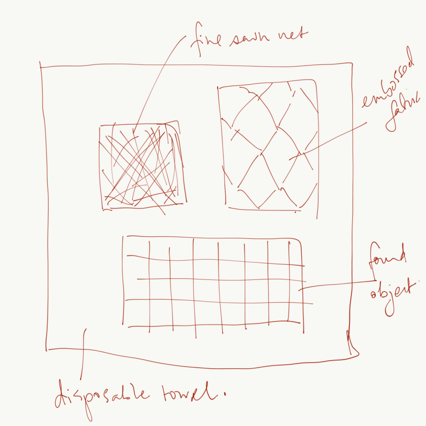
Going to restart and this time cut a square out of a disposable towel I found at work and work a stitched net in the background. Considering using some of my embossed look fabric and my found red grid on the surface of the towel as other references to embossing. 


Using Joomchi like bonding I tried to bind two layers of organza with silk fibre in between. I did a lot of work on this and ended up having to machine stitch to hold the layers together anyway. They did not bond in the sculpted fashion that paper did. I wanted to use this because a lot of effort had been put in but it’s not right. The thick lines do not evoke the fine mesh of my red collage or the drapy lines of the sewn paper sample. It doesn’t even refer to the graphic T shape because it’s so tatty.  I think it needs to be put aside unfortunately. 


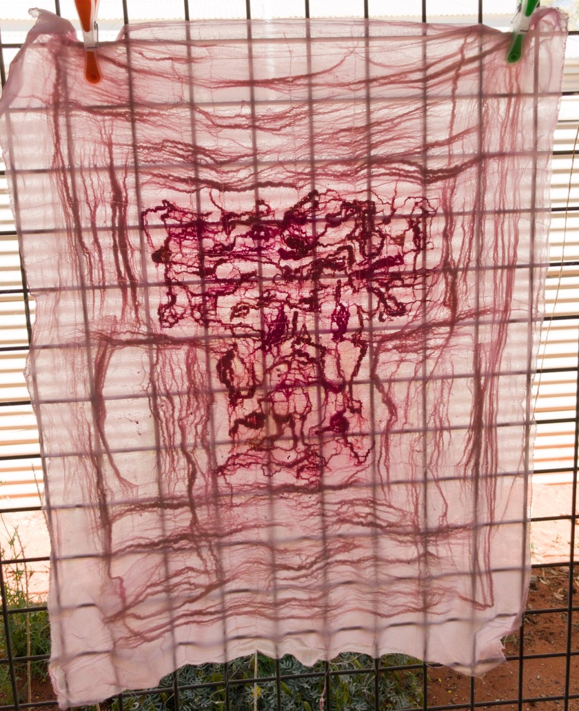
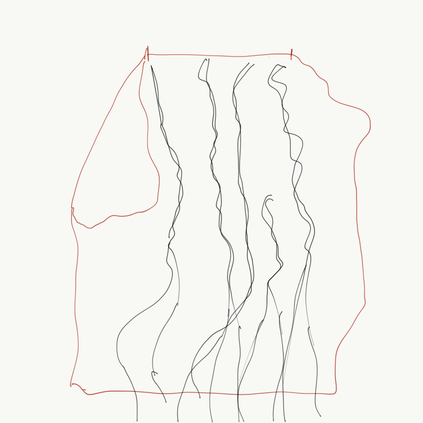
I think this large piece of dyed silk organza is what I will use instead. It is life size as clothing and I am thinking of sewing fine lines vertically with dark thread left to float free at the bottom. Simple sewing to highlight the drapy line. I’m thinking that because it is very thin material I will be able to utilise the fact that the lines will be seen from underneath as from the top. So will try intertwined lines as in my drawing and the paper sample. I’m aware that these are a series and thinking about linkage between the three. It is basically likely to be the red colour, and I plan to use only red and “black” thread. My black thread is hand dyed so it’s really more of a rich dark brown. I do have other threads with me too but I don’t usually work with much pure black. 


Here is another failed fabric Joomchi attempt. This is two layers of dyed raw silk that is bound together with milk silk. It is holding together enough to use but I have not been able to get the inner fibres to migrate to the surfaces. Thinking that I might be able to pull some of the fibres up with stitching. 

Plan here is probably to use this as a stiffer base. Possibly I will cut it into the T shape before stitching heavily over this with small stitches in the shape of a T possibly in a range of sizes or at odd angles as in my collage sample.


I’m not sure but I need to get started with these or they will not be done in time. 

Assignment two- Stitching: Placed and spaced. Sketchbook

Starting to think about my final series of three works. 

These are the three works I think I’ll be using to inform my first textile works. The features I am looking at are the embossing and the dense red textural colour in the first, the net overlay with something visible beneath and the kimono shape in the second, and the drape and linear marks of the third.

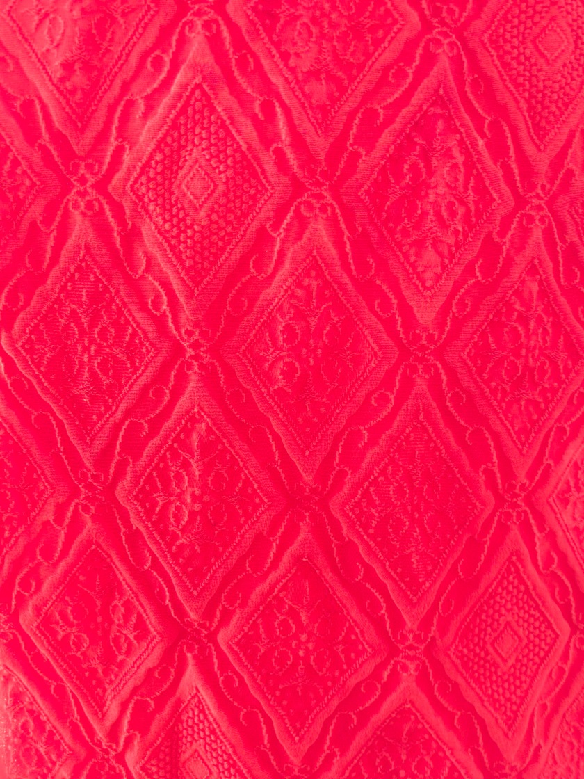
Actually looking more closely at the fabric, I think that the embossed affect is due to the weave rather than the stitching


Don’t know what this has come from. It was just lying on the ground in the middle of the road. There is a fair bit of discarded material on the ground here. Brian called our walk “going shopping for free art supplies”.

Thinking ahead 

Considering the need for some base textile to work on. I am living remote at present and only have undyed textiles that I brought with me, and some dye.

So before I think about manipulating the textile, I first have to consider what colours I would like to use in my base textiles. At this stage I’m not sure where I will be going with my textile works, but I can’t ignore my surroundings. I am draw to the distinctive colours of the outback, the red of the earth, the green of the plant growth and the blue of the sky.  

It’s going to be pretty hard to choose textile for my base because I don’t have much available  and I understand that I am making links always back to my drawings or my stitch works so possibly I should be using my cream/ white fabrics undyed as paper is undyed.  Actually reading the brief again I see that I should only be referencing colour in a limited way and relating it to the colours in my drawings.

Still I’m going to have some fun dyeing some fabric to use at some stage anyway in the colours of the outback.  I want to extend my work ultimately and apply what I’ve learnt to a body of work relating to my time here. 

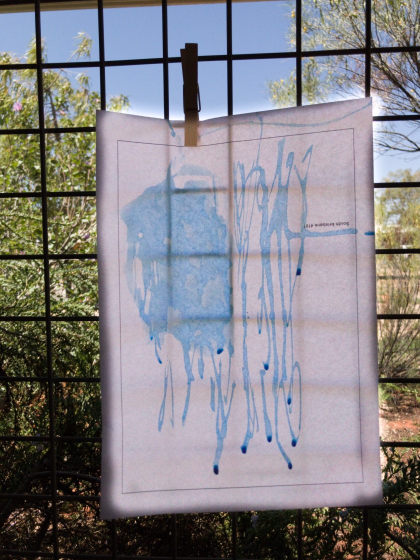
Here I am trying to match the colour of the sky with dye on paper

Developed and composed samples (2.4) Sketchbook entry


I have chosen embossing and Joomchi as the more successful of my paper manipulations and couching and visible running stitch  and loose thread as more successful of the stitch techniques. 

These compositions are pretty literal translations of my drawing but I did consider composition in the original drawings.

I want to use repetitive directional line to show the movement evident in the original yellow drawing and develop that drawing with the added dimension of texture and paper manipulation to make it a more complex drawing with greater depth. 

With the patch drawing I want to represent the mending quality of the central square and I plan to start with continuous line through couching and then go to running stitch with the same thread and even some loose thread to emphasis the mending quality.