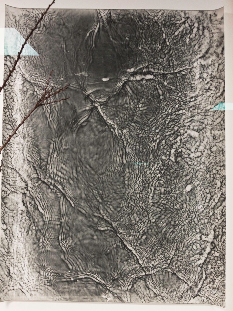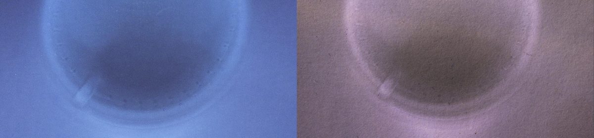
This is a layout of a bunch of the work I have done. Putting these together suggest that I could possibly use a range of techniques out the window. The fly is out there but could stay too. I have other imagery like that I could include.

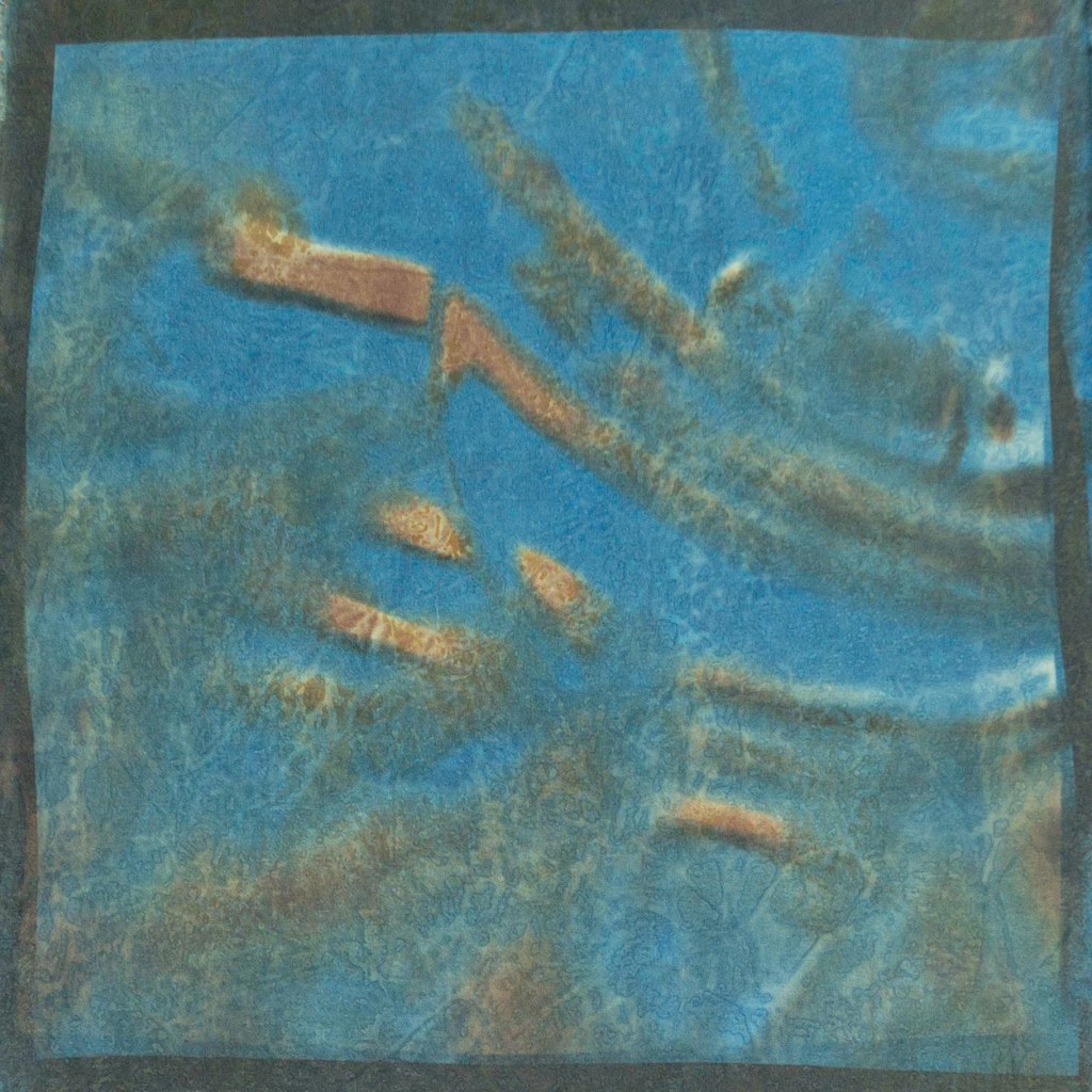
Feedback was good for the new prints but the mix was also ok. Martin started by saying the coherence of the wine glass was good but then moved on to also saying he liked the variation. I’m attracted to the variation. The theme is the things that surround me whilst I’m looking out the window at the world in this covid time. Or could be more specific, looking out at the world through the lens of a wine glass literally. So I’m sure the wine glass would resonate with lots of people. I’m going to do more work printing and then decide which is working for me for my final nine patch. I’ll do more wine glasses too as well as the photogram ones. If nothing else I’ll end up with lots of fabric for future works.
I may be able to get more variation within the wine glass lens series. I’m working on colour contrast rather than tonal contrast. So maybe I should ditch trying to get colours from the actual photo and simply pick one colour from the image and use its complementary for the second colour. That is effectively what has happened in the top left and that one works the best. I also need to be a bit careful about overexposing the first colour because the fabric will only take so much dye and not develop further colour over the top if I push the first exposure to its limit.
It’s meant to reference windows in a grid.