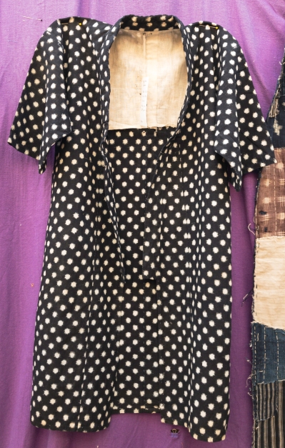
Child’s kimono:
 I was told that children might have worn a kimono like this to school and I have found an old photo on line with the young boys wearing a kimono like this. Here is a fragment of the photo from a website/blog with lots of old Japanese photos.
https://oldjapanphoto.wordpress.com/2007/12/17/vintage-japanese-photo-school-children-kimono-portrait/ Viewed 6 July 2017

On my kimono the store has placed this label:

Kasuri means fabric dyed by using resist dyed threads prior to the weaving process. Ikat is the resist dyeing method whereby the threads are bound to create areas of resist to the dye.
https://en.wikipedia.org/wiki/Kasuri viewed 6 July 2017
The fabric feels like cotton but it is quite crisp. I wonder if some starch finishing has been added at some stage, possibly prior to on selling as an antique.
On the back of the label it states that gentle treatment is needed for washing this fabric – hand wash – as it is fragile now from age. Normally cotton can stand up to hot machine wash and the dryer but I imagine if I subjected this kimono to that it would show it’s age much more.
Wikipedia also provides a link to a book on Ikat fabric written in 1975 https://yoshikowada.files.wordpress.com/2014/07/yw-ikat_an-intro-002.pdf Viewed 6 July 2017
This Kimono is a woven Kasuri fabric. The cotton threads were first resist dyed and then woven by hand into fabric that allowed a pattern to be created. Traditionally the weaving was done by hand in rural Japan. It is hand sewn together, maker unknown but likely to be for personal use.
The kimono has been bought at auction in Japan. I am not able to know what part of Japan it was originally from. It is likely that the cotton fibres were produced in Japan, where cotton was made in the west but not in the north where it was too cold for cotton. The traditional dye used was indigo.
https://www.kimonoboy.com Viewed 6 July 2016
This site gives a good potted history of Japanese textiles, but it is a commercial site and I’m not sure of it’s validity. I have books coming that I will also be able to use for further investigation but this will do in the meantime.
Kimonoboy’s Antique Japanese Folk Textiles
The above is a pdf from the above website.
Traceability may be important for historical purposes, to investigate the story behind the textiles, to understand the properties of a textile if you plan to use it in textile art, and to establish the genuine antique status of a textile. Maybe other reasons too but I’m late for work. Will add in if I think of others.
I might be able to find out more information through history books, other internet sites and other archives or museums.
This little kimono looks like it would have fitted a primary school child, and looking online suggests that this style was more for the younger children. It is is very good condition and I suspect it has been sprayed and pressed for sale. There are no holes in the outer fabric, but the inner yoke lining does have some thinning of the fabric with holes. The arm pits are reinforced and this has broken down a little bit with some loose thread visible.

The kimono is not personalized in any way, but the reinforcing suggests that it was made for use rather than decoration. The hand stitching could well have been done by a mother for her child. It is not labeled in any way inside.
I feel some mild nostalgia in relation to the kimono. But it is not my cultural heritage and as such feels also a bit foreign and novel. Whilst there are common nostalgic themes-a child now grown, perhaps even likely dead- that as a mother I can identify with, it is not the strong nostalgia I would feel about a textile that reminded me directly of my own now grown children. For example fleece with a pattern similar to the track suits I made for my children.
Boro futon cover:

This is a fragment of a cover made for sleeping futons. Could be either underneath or over the top like a blanket according to Jan (japanese shop owner).
It is made from scraps of fabric, likely cotton or hemp.
Cotton was prized for its softness and warmth in Japan but in the north where cotton could not be grown, scraps from the south were used in this boro patchwork style. Hemp was the traditional weaving material of the north of Japan.
A textile like this would have been washed when in use, but is now so fragile through age and degradation of use that it would like deteriorate significantly if I washed it.
A lot of my information in regard to this piece is coming from a book:
Rags and Tatters from the Far North of Japan, 2008, Yukiko Koide and Kyoichi Tsuzuki (eds), ASPECT Corp, Tokyo, Japan
The fabrics used in this fragment are all woven fabrics. Traditionally weaving was done by hand on small looms but later factories produced machine woven cottons for use. There is various types of weaving, plain and patterned weaves and double ikat weaving, as in the kimono above. This textile would have been assembled from fragments with a view to providing warmth. It has been hand stitched together with heavy duty thread and large stitches in the style that has come to be known as Boro. Originally boro was not a textile art style but a purely functional means of assembling a larger textile from scraps for very poor people in northern Japan. It is well worn and stained in parts. Some holes have been patched but others have developed in the patches. Larger pieces on the back are largely shredded. Multiple layers are employed to give added warmth.


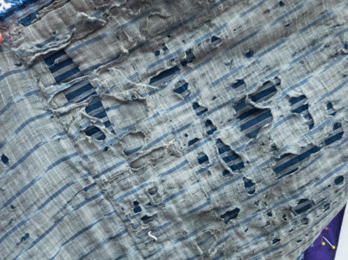
It has been a durable and sturdy piece in the past but is now so degraded it is no longer of much practical use.
The label indicates that it comes from the late 19th or early 20th century. I’m assuming this is really just a guess based on the known timing of the production of these sort of items. These items have been bought at auction in Japan so probably have variable traceability and there is further loss of this in the transport to Australia. 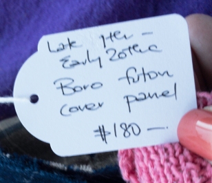
I selected all these items because they have a sense of history and story, and in this way a nostalgic element. Of the three, this one is probably the most evocative of a time when women were struggling with whatever they had to improvise warmth for their families. It would be easy to romanticise this simple life, using materials at hand and heavily recycling, although I suspect that the truth was a little more harsh and miserable.
Sake draining bag:

Sake draining bags were used to filter solids out of the fermented sake. They were made of cotton which was woven and periodically treated with persimmon juice to help preserve the fabric. It was likely to be hand woven and visibly hand sewn. The bag has been used and is now perished in multiple parts. This bag has not been repaired so it is likely that it was not in use after it began to perish. Many bags like these are repaired with heavy thread for continuing use. In the shop I was told that these bags are now prized to be made into hand bags, presumably because of the leather like appearance that has resulted from the persimmon juice.
The bag feels thick and leathery but fairly brittle now. I can see that there is a lack of fraying at the edges of those holes, presumably also due to the persimmon juice.

All three of the above pieces reflect the heritage of Japan, demonstrating textile practices that were utilised in the last few centuries of Japanese history. Much has changed in the second half of the twentieth century for Japan, and these sort of textiles are records of the type of rural society that existed in Japan for a long time prior to its transformation after the second world war.

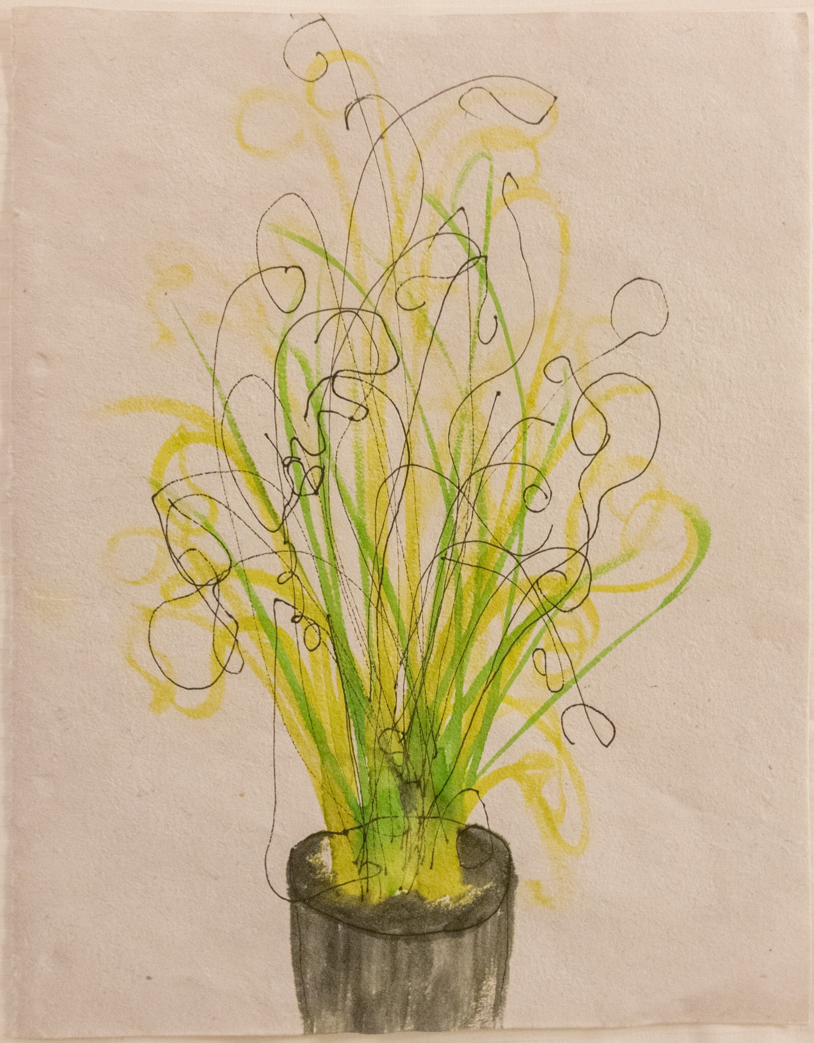
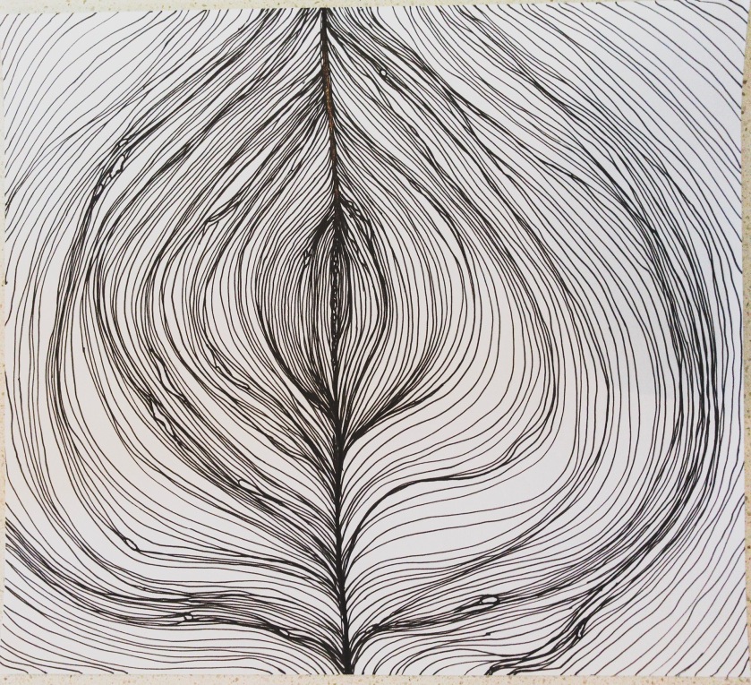
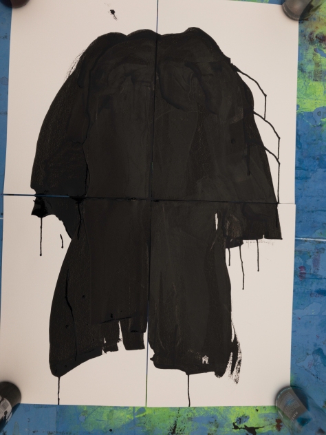
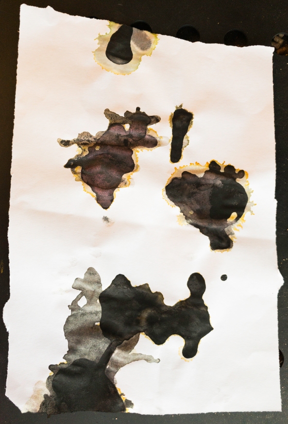
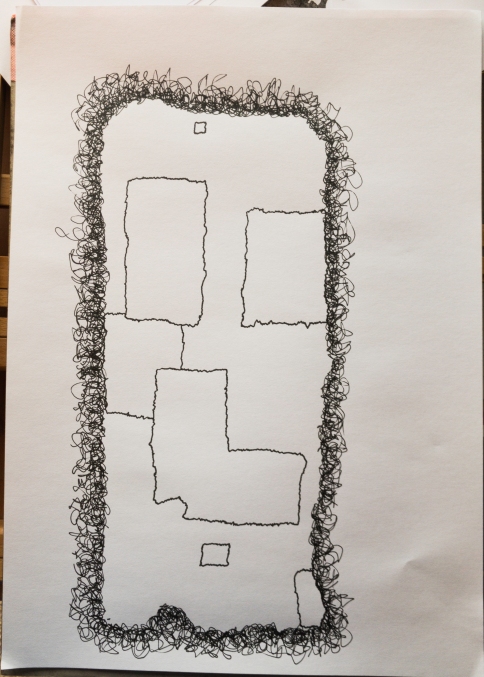
 This time I have reversed the process and painted first and then applied the lines over the paint. I have not traced around my paint, but redrawn the image in ink repeating lines until I felt they were right.


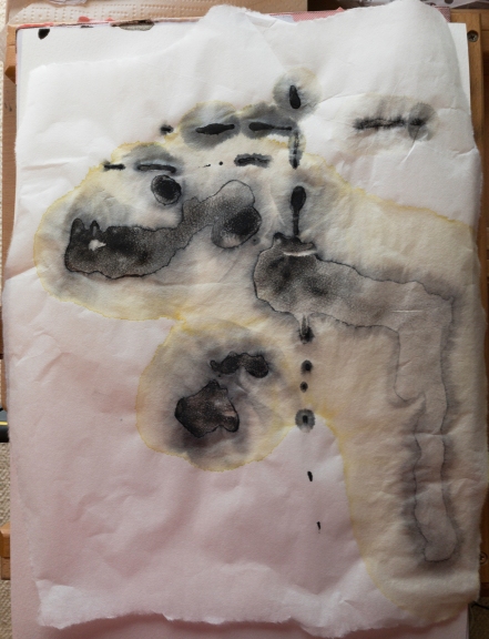
 This is the photo I worked from, and I also used an inverted version to highlight the lines of light coming through the holes in the bag.